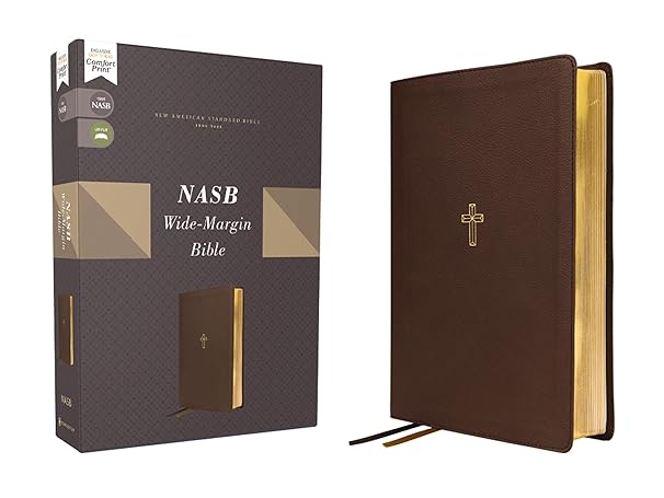
I just received an Advance Review Copy of Zondervan’s newest Bible. It boasts several features and I want to look at each of them. Before I do, I admit, I’m traditional in many ways. I prefer to read paper. This Bible has the traditional gold edge pages. The pages are still lightweight, but much thicker than what we used to call “onion skin.” There’s something almost elegant to me of the feel of the super fine pages. It adds to the feel of specialness to the book you are holding. But, those thinner pages get crinkled, tear easily, and don’t lend themselves to highlighting or adding notes.
Wide Margins
The name of this particular edition of the Bible could not be more true. The margins are HUGE. At first glance, it just felt strange. But, if you are a note taker and like to put your notes in there next to the verses, then this is the Bible for you!
Two-Color Page Design
Admittedly, I am color-blind and often miss subtle differences in color. But, I can see at least some of what they intended and the pages are indeed pleasant to look at. Admittedly, this is probably the least important feature to me.
Concordance
I was surprised when I looked at the concordance. I was automatically expecting something along the lines of a Hebrew/Greek concordance. What makes this feature really exciting is that it is an English language concordance of the Bible itself. So, if there is a verse that you can’t quite remember where it is or maybe even the complete verse, just flip back to the concordance. You can look up the beginning of a phrase or the name of someone in the Bible and find the applicable verse or verses. Of course, there is no way it could possibly be completely comprehensive. But I was very impressed with how thorough it is.
Ribbon Markers
I love ribbon markers in my Bible. I love having one to mark where I’m reading for my daily time. And I love having a second for either when I am preaching or marking a passage that I know is going to come up in a study or sermon. What really impressed me was that they are two different colors!
Faux Leather Lay-Flat Design
This is a personal preference thing that doesn’t work for me. If you do your Bible reading at a table or desk, then this feature would be super handy. However, I sit with my Bible on my lap. To me, it just felt floppy. (This is easily addressed with a Bible cover.)
Comfort Print Typeface
I can’t tell you what about this proprietary typeface is even different from the old standby of Times New Roman or something similar. But it is indeed just pleasant to read.
NASB 1995
Zondervan has released several editions of the New American Standard Bible over the years. The latest one was in 2020. I have no idea why they put this out in the 1995 edition, but it does happen to be my favorite. Whenever I use an online source for my studies, I always use the 1995 NASB.
But what is special about the NASB? It’s definitely not the easiest to read! But it is translated in a word-for-word style as opposed to a phrase-by-phrase style. It doesn’t read as smoothly as some other translations, but I have found over many years that without going to the original languages, the word-by-word translation style gives the best understanding of exactly what the scriptures really mean in the original languages.
Summary
I find this to be an excellent Bible for study. The concordance more than makes up for the lack of notes that you might find in a typical study Bible. But this is the kind of Bible that you hold dear to your heart and never want to part with because you’ve not just read it but interacted with it by making notes and reflections. This is a Bible I can see my children or grandchildren looking at to see what touched Grandpa.